The Decision Logic ready-made dashboards equip you with Company Health, Labor, and Day Part information.
Selecting a Dashboard
Enable Dashboards
- To view the Dashboards, add them to user profiles
View all Dashboards & Features
Navigate to Reports > Sales and Ranking > Dashboard
- To change dashboard views select an alternate dashboard from the drop-down menu in the upper right-hand corner.
- The dashboards that are currently available are Company Health, Labor, and Day Part.


- Users with Company, Region or Group level access can adjust the stores included in the dashboard by clicking on the Show Store Selector button and adjusting the hierarchy.


Dashboard Detail
- A user can view data for the widget metric by clicking on the Information icon.
 Click ona metric in the legendto include or exclude datafrom a chart.
Example: The default view includes Food Sales, Bar Sales, and Guest Count data.


- To view the values for a specific point in time on a graph mouse over the date on the graph.

The widget panel will flip over to revealing widget detail or roll-up data.

- To enlarge a graph or chart and adjust the view click on the
 icon.
icon.


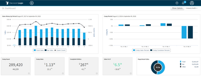
 Company Health Dashboard
- The Company Health dashboard provides a snapshot of metrics directly related to the company’s financial health.
- The top two graphs consist of a trailing year sales and guest count chart and comparative sales and guests for the current period.
- Additional widgets for current week guest count, comparative sales, reductions, and sales vs. last year, and department level are included in the second row of the dashboard.

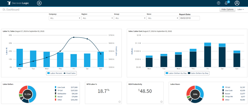
Labor Dashboard
- The Labor dashboard provides a snapshot of labor metrics for the current week.
- The top two charts are a Labor% to Sales dollar chart and a Sales to Labor Cost comparison.
- The second row of dashboard includes pie charts breaking out labor dollars and labor hours by job code, and WTD labor % and BOH productivity widgets.

Day Part Dashboard
- The Daypart dashboard provides several visualizations of day part data.
- The top two charts allow the user to analyze daypart sales dollars and compare day part PPE to day part productivity.
- The second row includes pie charts for day part labor dollars and daypart sales.

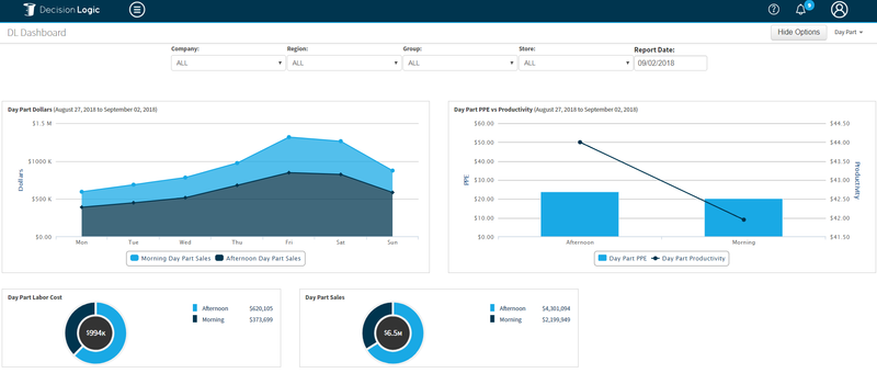
Table of Contents
| Table of Contents |
|---|
For additional questions or assistance please submit a support ticket by visiting our Customer Support Portal or emailing us directly at helpdesk@decisionlogic.co